Need someone to lead product management at your software company? I create software for people that create software and I'm looking for my next opportunity. Check out my resume and get in touch.

Fresh paint

Freshness Warning
This blog post is over 19 years old. It's possible that the information you read below isn't current and the links no longer work.

If you’re reading this in a browser you’ve no doubt noticed that the site looks different. If you’re reading this in a news reader, then you probably don’t care what the site looks like. The previous design has been hanging around for nearly four years, although the details have changed over time.

Many times over the last few years I’ve wanted to redesign this site and several times I’ve actually started on a new design. Each time something has kept me from completing the design and putting it online. Instead, I’ve nursed the old design along, changing elements here and there, refactoring the site and evolving the design.

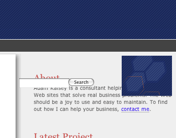
This time, I didn’t set out to redesign the site. I simply wanted to continue the progression of small improvements. Something I’ve always felt about the design of this site is that the logo wasn’t strongly tied into the rest of the site. The orange hexagons weren’t reflected anywhere but the logo. My plan was to simply add some orange and some angles into the design. Before I knew it, I had completely changed the design of the site.

Although there were some technical problems with the layout and some things about the new design I didn’t like, but overall things seemed to be working pretty well. So I dumped the old stylesheet, tweaked my templates and uploaded the new files. Now I have a new point from which to start my refactoring.

Some of the technical problems have now been solved, but others remain. A portion of the banner at the top overlaps the menu in Opera. That particular problem was introduced after a workaround of an IE/Win CSS bug. Given the numbers of people using Opera on this site, I’m not going to spend much effort fixing the Opera problem.

One problem I’d like to fix is in Safari. The search field and the graphic at the right of the banner both are positioned about 100 pixels too low — but only on pages within my blog…

screen capture of a layout problem in Safari

The CSS is the same as the rest of the site, so there must be something in the HTML that’s fouling things up. I’ll hunt it down when I get a chance. Safari also won’t let me style the form buttons. I don’t really want to use an image for the submit button for a variety of reasons, so I’ll have to live with the unstyled button.

Poke around the site and let me know if you find anything terribly wrong. If you come across a page with the logo sitting on a white background, it’s using the old template with the new CSS and will be updated eventually. Constructive criticism and suggestions on the design are more than welcome.

Jeroen
July 9, 2004 12:23 AM

Really nice! One remark: the small texts used in the footer and above the comment form are really small (I use Firefox on Windows).

Nick
July 9, 2004 1:32 AM

I MUST get round to doing drop shadows! This looks really cool. Couple of problems - no images of portfolio sites in IE6, for me anyway, but they come up fine in Firefox. And if you want really small text, take another look at your contact details! Minute on 1280x1048.

kartooner
July 9, 2004 6:19 AM

Looks good to me. That is, it renders nicely in Firefox 0.9.1. Also, I love the large headers for the articles.

Christopher Horrell
July 9, 2004 7:01 AM

Nice job Adam! I really like how you've tied the tabs and search button with the logo. Too bad Safari doesn't accept button styling. It's something that's vexed me for awhile. I've noticed that most of you pages -- like this one -- don't have a doctype. This might be causing your Safari positioning problems, but that's just a guess. I'm sure you'll get everything sorted out over the weekend.

Neil T.
July 9, 2004 8:28 AM

Brilliant. A huge improvement. Feels very professional. :)

Adam Kalsey
July 9, 2004 9:08 AM

Porfolio images fixed -- dang IE disappearing float bug. If you have floated elements vanish in IE, try giving the element some dimension (width: 4em;) or use position: relative. The doctype is slowly being added back into the pages. It's one of the side effects of stripping the templates down and starting over. I've got it in the weblog pages now. The small text size has been bumped up a notch. The contact details were small in IE because I missed a closing UL tag in the feed list above it.

Christopher
July 9, 2004 4:08 PM

Hey Adam, I was just checking out the site in Safari (1.2.2) now that the doctype is there and the search field and the graphic look OK. I figured you were still tweaking your new MT templates and it was a matter of time for everything to fall into place :-) Once again, nice job Adam!

dclal
July 10, 2004 4:56 PM

The site re-design is looking nice. In Safari 1.3 Developer Beta (v146) the cut corner on the tabs display a slightly different background color than the grey background stripe. I don't see it in Camino or Firefox though, so it may just be a weird Beta issue. The non-styled buttons don't bother me, although they do look cool when displayed correctly.

Dane Carlson
July 10, 2004 8:19 PM

Adam, the site redesign looks fantastic!

Mike
July 12, 2004 9:52 AM

The drop-shadow image is a nice touch. Good professional use of CSS. Well done.

Jason
July 12, 2004 12:53 PM

Very nice. I like the new design.

Margaret
July 12, 2004 1:54 PM

Cool new site design, but would you please re-do your wonderful "Button Maker" page? I loved making buttons through that page, and now I cannot. All that appears on the page is the first section and the "submit" button... :o(

Mike P.
July 13, 2004 3:29 PM

Hey, I like the redesign, and in this case that's no easy task, as I was a fan of the old site. Wow, looks great on the CRT!! Nice.

Margaret
July 14, 2004 6:51 AM

Yay! Button Maker is back! Thank you.

This discussion has been closed.

Recently Written

Too Big To Fail (Apr 9)
When a company piles resources on a new product idea, it doesn't have room to fail. That keeps it from succeeding.
Go small (Apr 4)
The strengths of a large organization are the opposite of what makes innovation work. Starting something new requires that you start with a small team.
Start with a Belief (Apr 1)
You can't use data to build products unless you start with a hypothesis.
Mastery doesn’t come from perfect planning (Dec 21)
In a ceramics class, one group focused on a single perfect dish, while another made many with no quality focus. The result? A lesson in the value of practice over perfection.
The Dark Side of Input Metrics (Nov 27)
Using input metrics in the wrong way can cause unexpected behaviors, stifled creativity, and micromanagement.
Reframe How You Think About Users of your Internal Platform (Nov 13)
Changing from "Customers" to "Partners" will give you a better perspective on internal product development.
Measuring Feature success (Oct 17)
You're building features to solve problems. If you don't know what success looks like, how did you decide on that feature at all?
How I use OKRs (Oct 13)
A description of how I use OKRs to guide a team, written so I can send to future teams.

Older...

What I'm Reading

Contact

Adam Kalsey

+1 916 600 2497

Resume

Public Key

© 1999-2024 Adam Kalsey.