Simplified Form Errors
17 Jul 2003
One of the most frustrating experiences on the Web is filling out forms. When mistakes are made, the user is often left guessing what they need to correct. We’ve taken an approach that shows the user in no uncertain terms what needs to be fixed.
The problem
Most forms require validation — checks to see that required fields have been filled out with the right information. But when a mistake was made, how do you let the user know? The approaches taken by many sites leave much to be desired.
- Show the error messages on a different screen than the form. The user has to remember what was wrong when they go back to correct the form. Often when they go back, their form information is now missing.
- Validate one field at a time. The user is told to fix their email address, but when they do, they’re told they also need to include their phone number.
- List the errors at the top of the form. The user needs to scan the form matching the error with the appropriate fields.
- Highlight the erroneous fields. The fields are often highlighted by changing the colors. Visitors with vision disabilities, with text browsers, or browsing from non-color devices have trouble figuring out which fields were wrong.
- Show an icon or symbol next to the offending fields. The user isn’t expecting those icons, so they aren’t looking for them.
Simplified
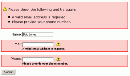
Here’s how we simplified the error screen.
- Show all of the errors on the form itself so the user doesn’t have to remember what the errors were in order to correct them.
- Fill in the information the user has already entered so they don’t need to re-enter it.
- Show the user a summary of everything that needs to be changed, right at the top of the form. This way, they don’t need to hunt through the form looking for error messages.
- Show an error icon in the summary of errors and repeat that icon after each field that is filled in wrong. The user immediately associates the icon with the errors and can quickly find them in the form.
- Surround the field with a colored box and repeat the error message right next to the field. The colored box draws attention to the missing information and the error text explains exactly why that field is highlighted. The user doesn’t need to look back up at the error list to understand why this field is marked.
- Use three different indicators to show which fields have a problem. By not relying on images or color to show the problem fields, we’re increasing the odds that the messages are accessible to more people.
We’ve provided a demo of the simplified form. Go take a look.
The code
In addition to simply showing the form layout, we’ve also written up an example in PHP. The form validation is simple, but it’s easy to adapt this to your own validation needs or to another programming language like ASP or Perl.
<?php
// Create an empty array to hold the error messages.
$arrErrors = array();
//Only validate if the Submit button was clicked.
if (!empty($_POST['Submit'])) {
    // Each time there’s an error, add an error message to the error array
    // using the field name as the key.
    if ($_POST['name']=='')
        $arrErrors['name'] = 'Please provide your name.';
    if ($_POST['email']=='')
        $arrErrors['email'] = 'A valid email address is required.';
    if ($_POST['phone']=='')
        $arrErrors['phone'] = 'Please provide your phone number.';
    if (count($arrErrors) == 0) {
        // If the error array is empty, there were no errors.
        // Insert form processing here.
    } else {
        // The error array had something in it. There was an error.
        // Start adding error text to an error string.
        $strError = '<div class="formerror"><p><img src="/images/triangle_error.gif" width="16" height="16" hspace="5" alt="">Please check the following and try again:</p><ul>';
        // Get each error and add it to the error string
        // as a list item.
        foreach ($arrErrors as $error) {
            $strError .= "<li>$error</li>";
        }
        $strError .= '</ul></div>';
    }
}
?>

<style>
label {
  width: 80px;
  text-align: right;
  float: left;
}

.formerror {
  border: 1px solid red;
  background-color : #FFCCCC;
  width: auto;
  padding: 5px 0;
}

.errortext {
  padding-left: 80px;
  font: bold smaller sans-serif;
}
</style>

<?php echo $strError; ?>
<form method="post" action="<?php echo $PHP_SELF; ?>">
<!--
For every form field, we do the following...

Check to see if there’s an error message for this form field. If there is,
add the formerror class to the surrounding paragraph block. The formerror
class contains the highlighted box.

Insert the contents of what the user submitted bak into the form field.

Check again to see if this field has an error message. If it does, show
the error icon and the error message next to the field.
-->
<p<?php if (!empty($arrErrors['name'])) echo ' class="formerror"'; ?>>
    <label for="name">Name:</label>
    <input name="name" type="text" id="name" value="<?php echo $_POST['name'] ?>">
    <?php if (!empty($arrErrors['name'])) echo '<img src="/images/triangle_error.gif" width="16" height="16" hspace="5" alt=""><br /><span class="errortext">'.$arrErrors['name'].'</span>'; ?>
</p>
<p<?php if (!empty($arrErrors['email'])) echo ' class="formerror"'; ?>>
    <label for="email">Email:</label>
    <input name="email" type="text" id="email" value="<?php echo $_POST['email'] ?>">
    <?php if (!empty($arrErrors['email'])) echo '<img src="/images/triangle_error.gif" width="16" height="16" hspace="5" alt=""><br /><span class="errortext">'.$arrErrors['email'].'</span>'; ?>
</p>
<p<?php if (!empty($arrErrors['phone'])) echo ' class="formerror"'; ?>>
    <label for="phone">Phone:</label>
    <input name="phone" type="text" id="phone" value="<?php echo $_POST['phone'] ?>">
    <?php if (!empty($arrErrors['phone'])) echo '<img src="/images/triangle_error.gif" width="16" height="16" hspace="5" alt=""><br /><span class="errortext">'.$arrErrors['phone'].'</span>'; ?>
</p>
<p>
    <input type="submit" name="Submit" value="Submit">
</p>
</form>
