User Experience
Navigation highlights
7 Apr 2003
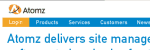 Atomz has redesigned their corporate Web site and introduced an interesting usability problem. They attempted to highlight a very important portion of their main navigation by having the "Customer Login" menu item use an orange background rather than the blue that the rest of the menu uses.
The orange is similar to the color of their logo, which sits right about the link. And the white menu text doesn’t provide much contrast to the button. At first glance, it appears that the orange area of the naviagtion isn’t a menu item at all.