User Experience
California State Fair
28 Jul 2003
The California State Fair lets you buy tickets in advance from their Web site. That’s good. But the site is a horror house of usability problems. It’s better than last year’s site, but it’s still obvious that the site is put together by amateurs with no budget. This is the largest economy in the country. The Fair is a huge production, and the Web site is a joke.
Hopefully, by studying their mistakes, you can avoid making them yourself.
Picking a product
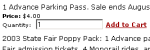 In order to buy tickets, you enter the number of tickets you want into a form and click a link labeled “Add to Cart.”
- The form fields are grouped too closely together making it hard to determine which field belongs with which item. Some white space or even a horizontal rule separating the items would help.
- The form fields are too long. You can type in a dozen or so numbers, but when you submit the form, you’re told “Invalid Quantity Entered.” You’re not told what a valid quantity would be. You apparently can order 999,999,999 tickets, but not 1 billion tickets.
- To submit the form, you have to click a link, not a button. People are used to clicking buttons to submit forms. Form submittal links also require the user to have JavaScript support in the browser and keep many browsers from accepting the Enter key instead of clicking the button.
Shopping Cart
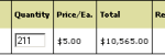 The cart form only displays order quantities as 3 digits but allows 4 to be entered. So if you’ve ordered 1000 tickets, the form displays 100 but calculates the pricing based on 1000. Hitting the button to update quantities would then reset the order to 100 tickets, even though you were able to ask for 1000 on the page before.
- You aren’t ever told how long the checkout process is. In the middle of filling it out, you don’t know if you’ve got one step more or ten.
- When you check out, you are presented with a prominent login form. The link to register as a new user is added to the end of the form almost as an afterthought. In an application such as this, most users will probably be making a one time purchase. How often are you going to buy tickets for a single event that lasts two weeks? The registration form should have at least equal placement as the login form.
- If you attempt to register with an email address that contains anything but commonly used characters, registration fails. The addresses a+kalsey@kalsey.com and mutt&jeff@kalsey.com both generate errors even though each is a valid address. Yet the registration form lets you sign up with me@kalsey_consulting.com, a completely invalid address (you can’t have an underscore in a domain name).
- Upon registering an email address that is already registered, you are told that the address already has an account but aren’t given any solutions. If someone already has an account but tries registering again, they’ve probably forgotten their password. The error message should offer to email it to them.
Payment
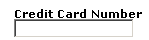 The credit card field only allows numbers, but the form doesn’t tell you that. If you use spaces in the card number (as it is printed on the card) you are told that your card number is too short. If you require a certain format to information in your form fields, let the user know. Make sure the error message makes sense to the user. My mother in law didn’t have any idea why she was being told her card number was too short. Either did I until I tested the form out in a dozen different ways. Oddly enough, if you enter a card number that really is too short, you get no error message at all.
- The form doesn’t tell you what information is required. All but one field on the payment form is required, but it doesn’t tell you that.
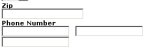 The checkout requires information that is really not needed. Billing and shipping phone numbers are required, but there is no need to have a phone number in order to process a credit card or ship an order.
- Allowing the shopper to automatically use their billing address as a shipping address is great, but in this case, the implementation is confusing. When you click the checkbox that says “Use my billing address,” the page is refreshed and the billing information you entered in the form is copied to the shipping address. That works fine if you fill out the form in the way the designer planned it. But if you check the box before filling out part or all of the billing form, the information never gets copied over. And if you uncheck the box, all of the shipping information is erased, even if you have modified it to be different from the billing address.
- The field lengths aren’t appropriate for the information they are supposed to contain. The phone number field is split into three parts, but each part is as long as the user’s name. This makes the phone number wrap awkwardly and also leaves the user wondering what needs to get into each field.
Usability is important in ecommerce. It can mean the difference between a customer and a frustrated user. Frustrated users aren’t likely to give you their money.