This is the blog of Adam Kalsey. Unusual depth and complexity. Rich, full body with a hint of nutty earthiness.
Navigation highlights
Freshness Warning
This blog post is over 21 years old. It's possible that the information you read below isn't current and the links no longer work.
7 Apr 2003
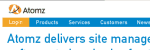 Atomz has redesigned their corporate Web site and introduced an interesting usability problem. They attempted to highlight a very important portion of their main navigation by having the "Customer Login" menu item use an orange background rather than the blue that the rest of the menu uses.
The orange is similar to the color of their logo, which sits right about the link. And the white menu text doesn’t provide much contrast to the button. At first glance, it appears that the orange area of the naviagtion isn’t a menu item at all.
Apparently I'm not the only one who had a problem with the menu's new look. Every week I get a customer newsletter from Atomz. Today's newsletter included an announcement of their redesign and the following paragraph. "Searching for the 'customer login' button? Don't worry, it's still there. It's just been moved to the upper left corner of the page, underneath the Atomz logo." Perhaps they should fix the problem rather than treating it as a training issue.
This discussion has been closed.
Brad Choate
April 7, 2003 2:49 PM
Yeah, with the login option highlighted like that makes me think -- "what, is this the login page?"